Description
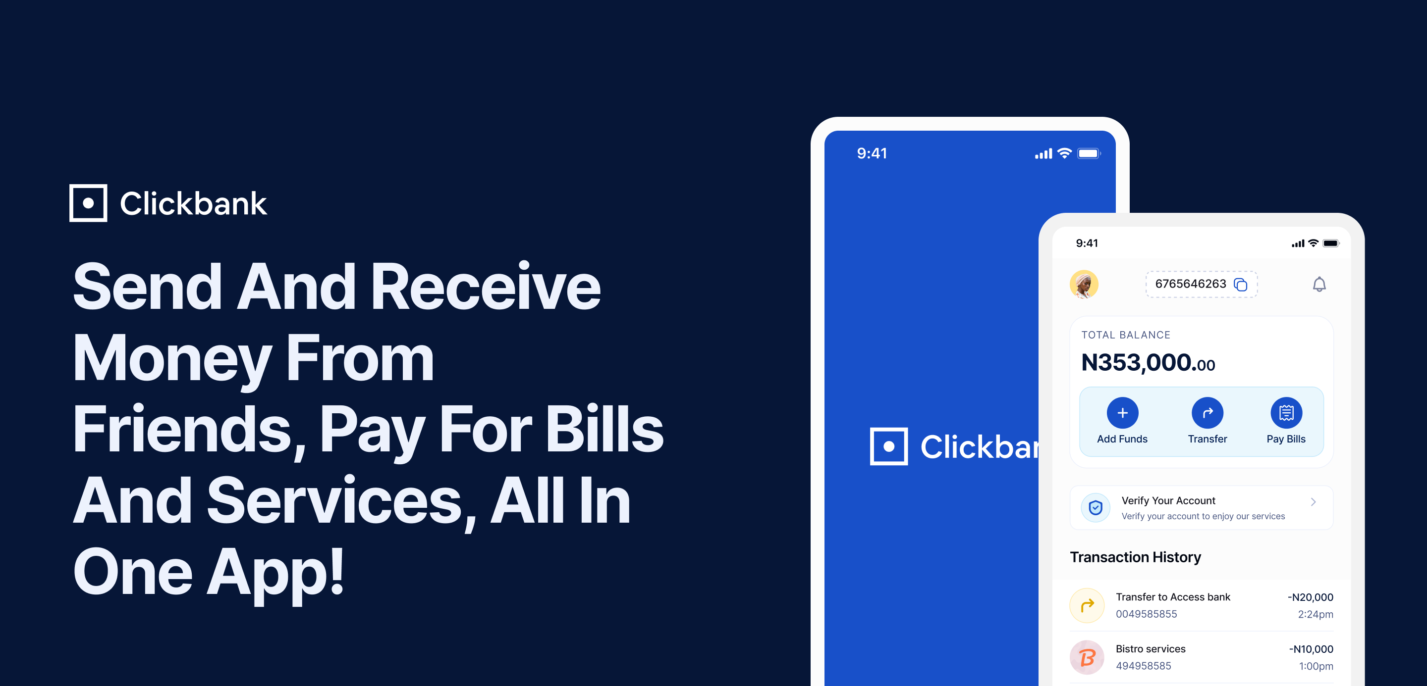
About this case studyThis is a case study for a fintech app that explains how a user sends and receives money, pays for services and bills, all in one app. Clickbank is a fintech product that places a number of facets at the forefront of its functions. They include; user onboarding, registration, BVN verification, transactions, and profile navigation. Why i created thisI created this case study for the purpose of a four-stage review. I was tested on my knowledge of product design, critical thinking, and my approach to proffering solutions. Who is this for I have decided to build this case study to help product designers, UX/UI designers, researchers, and product enthusiasts who are interested in learning how to create case studies like this, showing the behind-the-scenes, and the end results of the design process. An interesting fact; I scaled through the four interview stages with this case study.Table of content Design BriefUnderstanding The ProblemGoals and Focus PointsTarget AudienceResearchInsights and ThinkingApp Inspiration ScreensUser FlowsWireframes/Low-Fi PrototypesRegistration and OnboardingAccount VerificationTransactions, Profiles and Other FeaturesColor Choice and PalettesTypography ChoiceComponents and Style GuideHiFi Screens HighlightsHow to conduct product research.How to document a product scope.How to simplify complex ideas.Wireframe designs.20+ Screens.20+ Hifi Screens.Iconography.40+ Component Systems. This case study is FREE for anyone to download, You just have to insert $0 when you want to download. Feel free to support my work by adding any amount you want, this helps me create more highly valuable resources like this. Thanks for downloading.

Reviews
There are no reviews yet.