Description
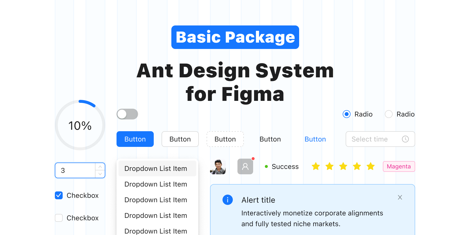
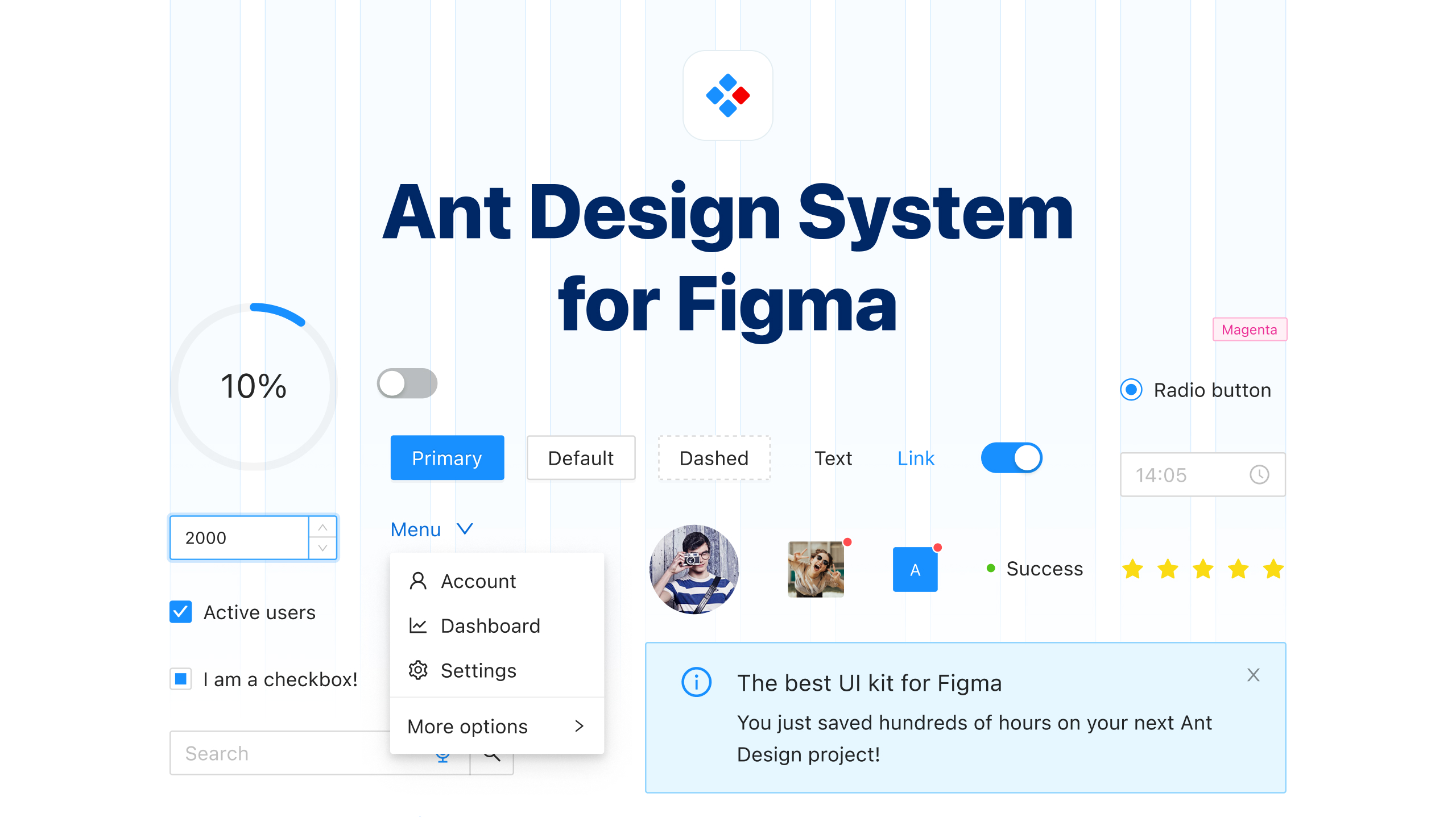
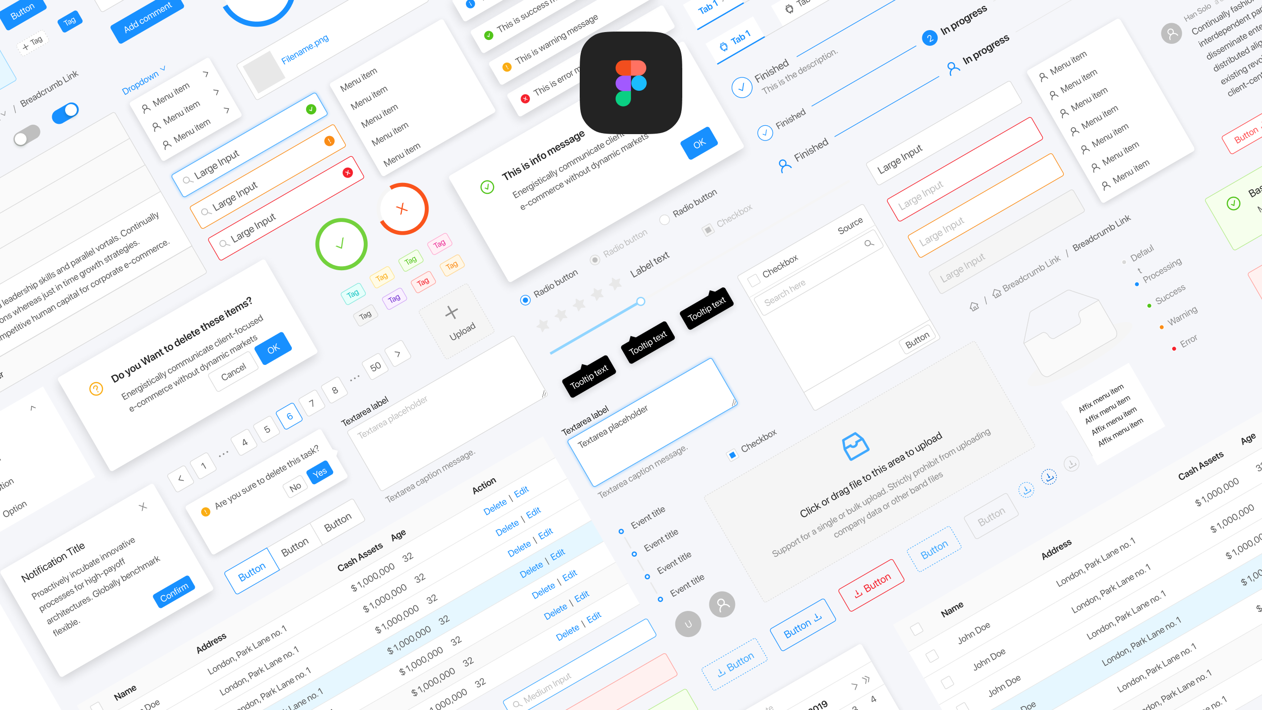
Design and develop Ant Design projects faster than everThe powerful UI kit for Figma based on the most popular React UI library – Ant Design. Create and implement well-documented Ant Design apps in no time! The UI kit is fully packed with the best features to make work easier for designers and developers working on Ant Design projects.Built with Figma Tokens that you can sync with your codeAuto layout 4.0, Variants, Component PropertiesHover and click interactions for easy prototypingSwitch between light and dark themeDeveloper friendly components Visit official websitePixel-perfect components your developers will love!Top-quality Ant Design components for FigmaThe components are built with the best Figma features, making the design process easy and fast.Fully customizableHover and click interactions for easy prototypingAuto layout 4.0Variants + Component propertiesDesigned with the development process in mindWe built each component with great features to make Ant Design’s project implementation process faster and easier for developers.Consistent with Ant Design of ReactSample React code in the Inspect panelQuick link to Ant Design docsBuilt with Figma TokensComponents use the same tokens and naming as the original Ant Design .less files. You can easily customize the entire UI kit and then sync it with your code.Fast and easy customizationSync with your .less files in the code projectEasily switch between light and dark themesCreate a multi-brand design systemEmpowered with smart Ant Design icon libraryDon’t waste time looking for icons with every new project you start. Use pixel-perfect 24×24 px icons consistent with the Ant Design library.Over 700 Ant Design iconsSample React code in the Inspect panelQuick link to Ant Design docsCustomize however you wantYou can easily apply your branding to the entire UI kit by changing the font, color, and component properties in a few seconds. What is more, you can later sync those changes with your code.TypographyChange the font family, font sizes, or line heights of all components at once in seconds.ColorsChange all colors of the design system or reference other colors from Ant Design with Figma Tokens.SpacingBy default, the system uses a 4px grid, but if you need to set up your spacing values, you can also do it in seconds with Figma Tokens.Rocket-fast implementationThe UI kit was built on the principles of Ant Design and optimized for Figma. The system is frequently updated and used by the best companies. While Ant Design System for Figma is a UI kit for design software, it has also been designed to simplify developers’ life so you can implement Ant Design projects quickly and efficiently.Sync Figma Tokens with your .less filesYou won’t find it elsewhere! Figma Tokens Sync is a dedicated feature we built on top of the Figma Tokens plugin that will allow you to sync your tokens with your Ant Design of React project. For example, you can change the primary color or font family in your Figma file and sync your changes with your Ant Design code project, which will reflect those changes.Use developer-friendly components and iconsUnlike other UI kits, Ant Design System for Figma focuses not only on designer experience but also puts a strong emphasis on developer workflow. Components have an example of the React code in the Inspect panel and a quick link to Ant Design documentation, so the implementation process is faster and easier.Switch between two themes in one file with one click.You can easily switch between light and dark themes in your project with the Figma Tokens. All you need to do is to select the required theme set in the plugin.The best Figma featuresAnt Design System for Figma uses the best features and plugins to save you hundreds of hours while working on your projects in Figma.Auto Layout 4.0: All components use Auto Layout. This feature lets you create designs that grow to fill or shrink to fit and reflow as their contents change.Components & Variants: Variants introduce a new way to group and organize variants of the same component. Components are easier to maintain and more intuitive to use.Figma Tokens: Whenever you change the token’s properties – Figma will apply those changes to any objects using that token.Used and loved by over 4000 solopreneurs and teamsFrom freelance designers to enterprise teams, Ant Design System for Figma is making the design process easier for design pros worldwide. Ant Design System for Figma is perfect for creating internal tools or client work. Companies like Zalando, Allegro, or eBay have already saved hundreds of hours on their UI design.⭐️⭐️⭐️⭐️⭐️This is an absolute time-saver. The entire product is prepared with utmost attention to detail, everything is well organized and easy to use even for inexperienced designers and developers who are not very familiar with design software. It helps to save hundreds of hours, so you can forget about recreating the same UI components in every single project over and over again. – Greg Dlubacz – Lead designer at Catenda AS⭐️⭐️⭐️⭐️⭐️Software Engineers that I have partnered with on projects that utilize the Ant Design are amazed that my comps are just like their code. This creates a powerful relationship. This kit gives you the power you need, ability to design faster, add customization that you need, and bring ideas to life. It’s definitely worth the price. – Christopher Carter – Freelance UI Designer⭐️⭐️⭐️⭐️⭐️Each component is constructed with care and precision. Covering more states and scenarios than you will find elsewhere. Not only that but the fact Matt constructs each component with auto-layout, makes this kit incredibly robust and flexible. It will supercharge your workflow and save you time, so you can focus on solving those complex UX problems! – Miriam Isaac – UX DesignerDocumentation | Licensing | Contact
Reviews
There are no reviews yet.