Description
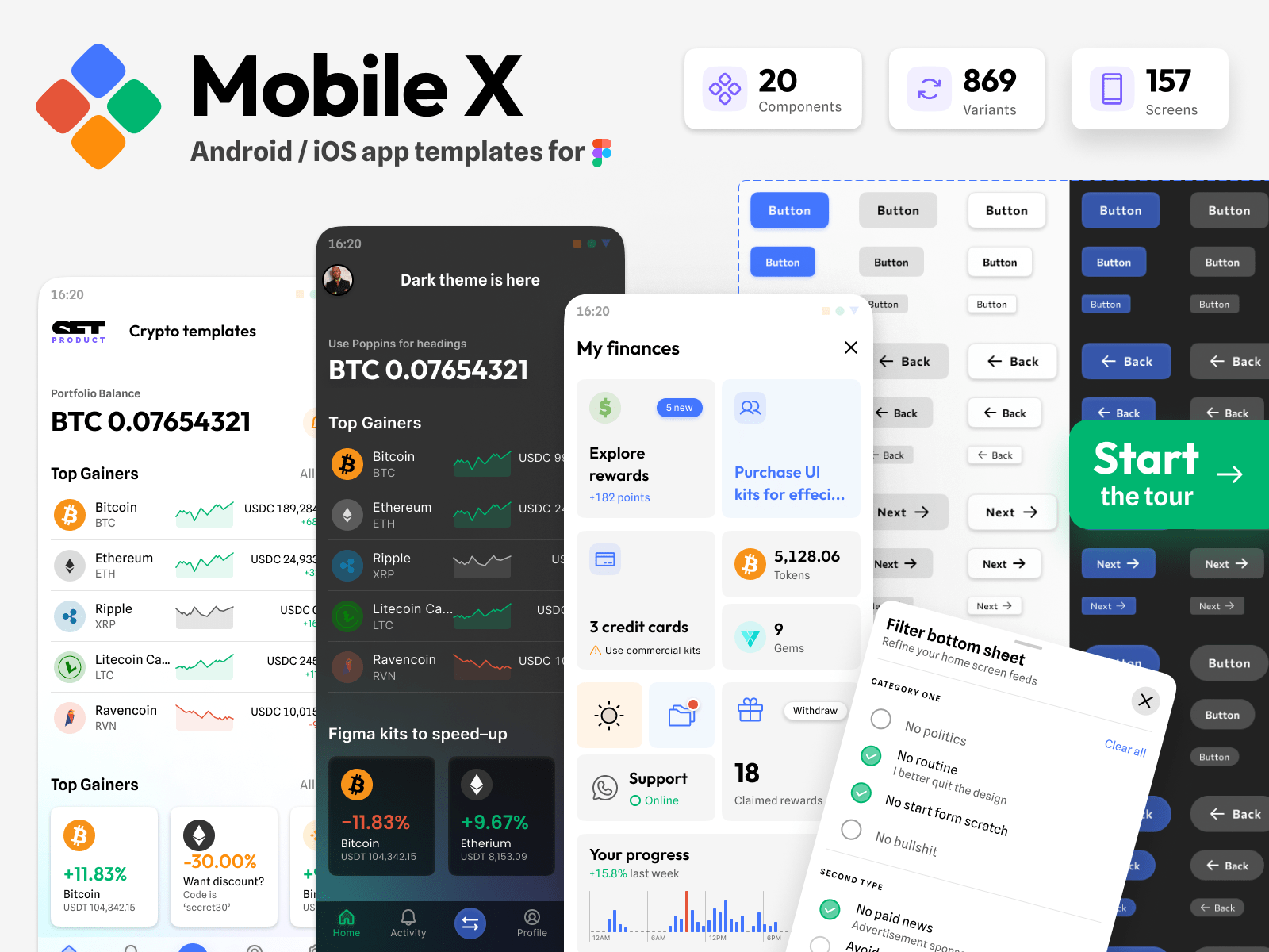
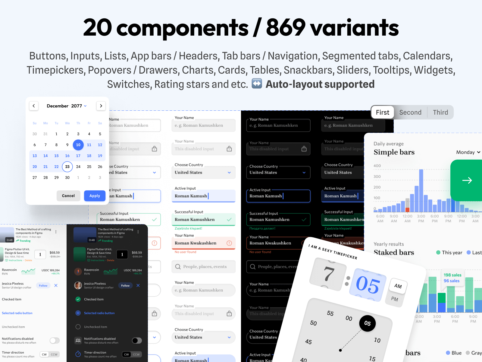
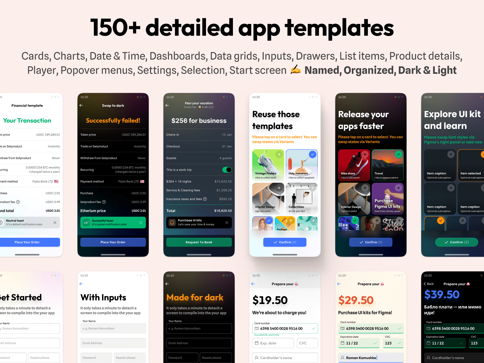
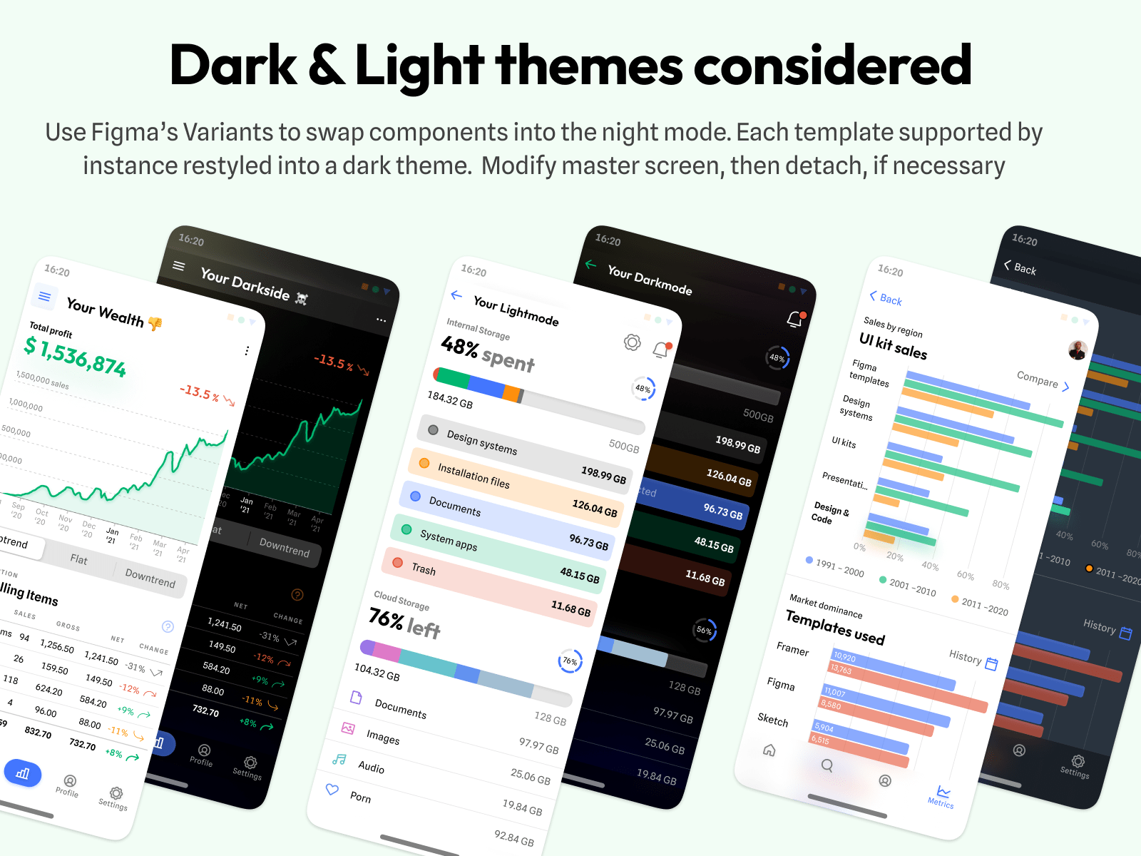
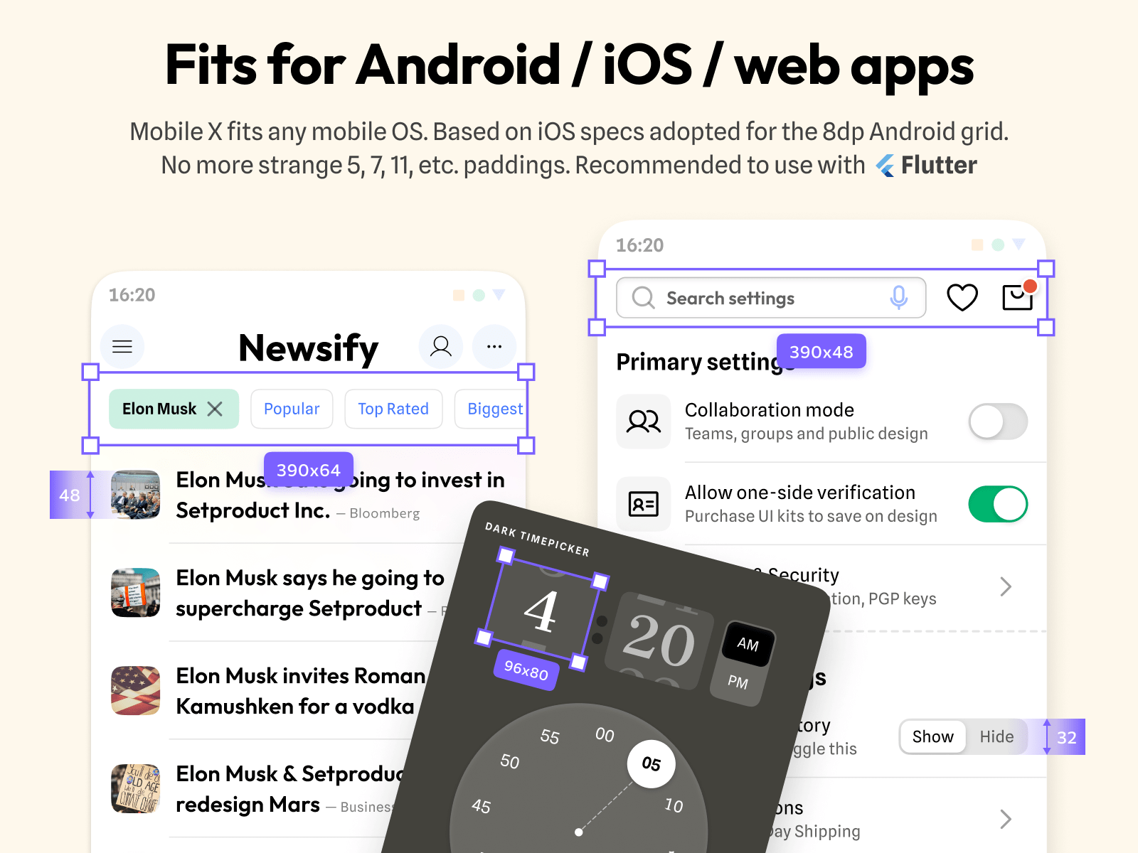
Mobile-X for Figma is a universal and styled UI kit that fits both iOS / Android app design purposes. Based on iOS specs adopted to 8dp grid and compatible with Android as well. Loaded with a huge collection of hi-end components with Auto-layout, and maintained as 157 dark & light screens which are ready to use. Made with free popular fonts (OFL): Spline Sans, Outfit, Inter, Poppins, Manrope.Contains 20 components, 869 variants, 157 mobile app templates Figma preview · Duplicate to try · Users’ reviewsHighlights:20 components with 869 variants. Buttons, Inputs, Lists, App bars / Headers, Tab bars / Navigation, Segmented tabs, Calendars, Timepickers, Popovers / Drawers, Charts, Cards, Tables, Snackbars, Sliders, Tooltips, Widgets, Switches, Rating stars and etc. ↔ Auto-layout supported.150+ detailed app templates. Cards, Charts, Date & Time, Dashboards, Data grids, Inputs, Drawers, List items, Product details, Player, Popover menus, Settings, Selection, Start screen ✍ Named, Organized, Dark & Light.Fits for Android / iOS / web apps. This kit fits any mobile OS. Based on iOS specs adopted for the 8dp Android grid. No more surprising 5, 7, 11, etc paddings. Recommended to code with Flutter.Dark & Light themes considered. Use Figma’s Variants to swap components into the night mode. Each template supported by instance restyled into a dark theme. Modify master screen, then detach, if necessary.www.setproduct.com/mobile-xFor businesses & startupsMobile-X is aimed at serious teams where designers and coders will collaborate more efficiently. Our product saves your time, money and pushes the release.For developersOur Figma resource allows you to learn or enhance interface design skills. Simply dip into the design process, where you only need to drag, drop and fit. That’s it!For designersStop creating again and again those boring UI bits along with every new project started. Use our Figma design systems to kickstart and never design from scratch.Licensing agreement • More for Figma


Reviews
There are no reviews yet.