Description
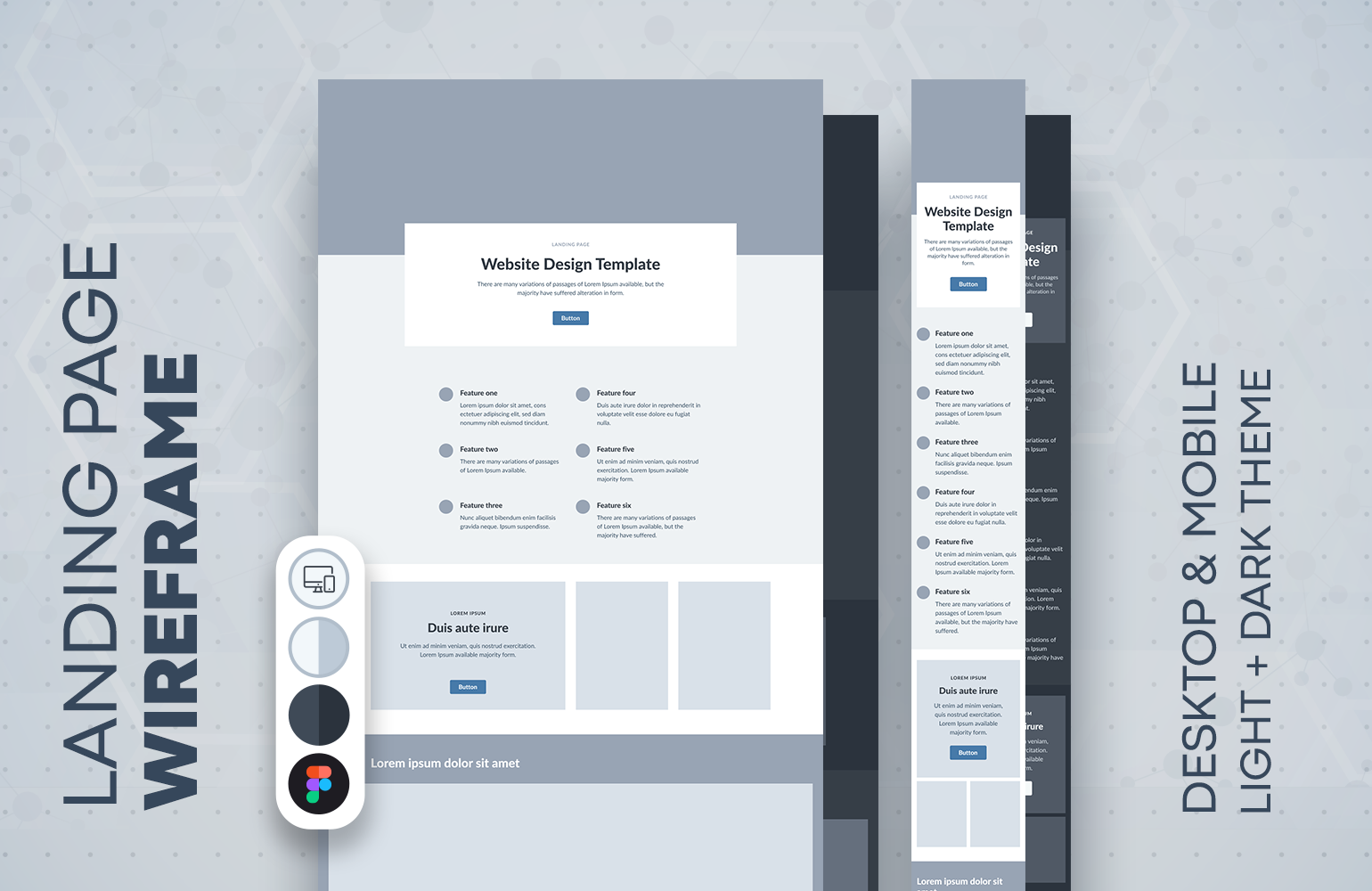
Landing page template. Desktop and mobile mock up. Modern responsive website design. Light and dark themes.When designing a landing site, it’s important to consider both desktop and mobile options to ensure that the site is optimized for all devices and provides a consistent user experience. Here are some tips for designing a landing site for both desktop and mobile devices:Responsive design: Use responsive design techniques to ensure that the site layout and content adjusts dynamically to fit the screen size and orientation of the device being used.Simplified navigation: On mobile devices, simplify the navigation to only include the most essential links, using hamburger menus or other mobile-friendly navigation patterns.Prioritize content: On smaller screens, prioritize the content by placing the most important information, such as the headline and call-to-action (CTA), above the fold and in a prominent location.Optimize images and videos: Optimize images and videos for both desktop and mobile devices, using responsive techniques to ensure that they look great and load quickly on any device.Test on multiple devices: Test the site on multiple devices, including desktops, laptops, tablets, and smartphones, to ensure that it looks and works as expected on each device.By considering both desktop and mobile options, you can create a landing site that is optimized for all devices and provides an excellent user experience for all visitors, regardless of the device they are using.




Reviews
There are no reviews yet.